


What is Heat Map Analytics?
Heat Map Analytics uses color-coded visuals to demonstrate activity levels or intensity across an asset’s surface or within a data set. Often employed to reveal user engagement, foot traffic hotspots, or utilization density, these maps help decision-makers quickly identify patterns. In a property context, a heat map could showcase which rooms see the most occupant flow or highlight exterior zones requiring maintenance.
Key Points:
- Visual Representation: Warmer colors (reds/oranges) signal dense activity, cooler tones reflect sparse usage.
- Application Scope: Ranges from occupant behavior, energy consumption, or even marketing insights.
- Real-Time Updates: Some systems feed constant data for ongoing optimization.
- Data-Driven Action: Results guide resource allocation, design tweaks, or occupant flow improvements.
By converting raw data into user-friendly imagery, heat map analytics expedite problem-solving and yield better-informed operational or design outcomes.
Recent Glossary
What is Digital Land Registry?
what is a duplex apartment
What is Escrow in Real Estate?
What is an Encumbrance Certificate (EC)?
What is a Credit Line?
View More...
Recent FAQs
What is the eligibility criteria for property insurance for a commercial building?
When is the best time to invest in a smart lighting system?
What is the average cost associated with a housing finance company loan?
When is the best time to invest in a 3D BIM model?
What are the latest trends shaping online land records?
View More...
Insight Pulse
Uncategorized
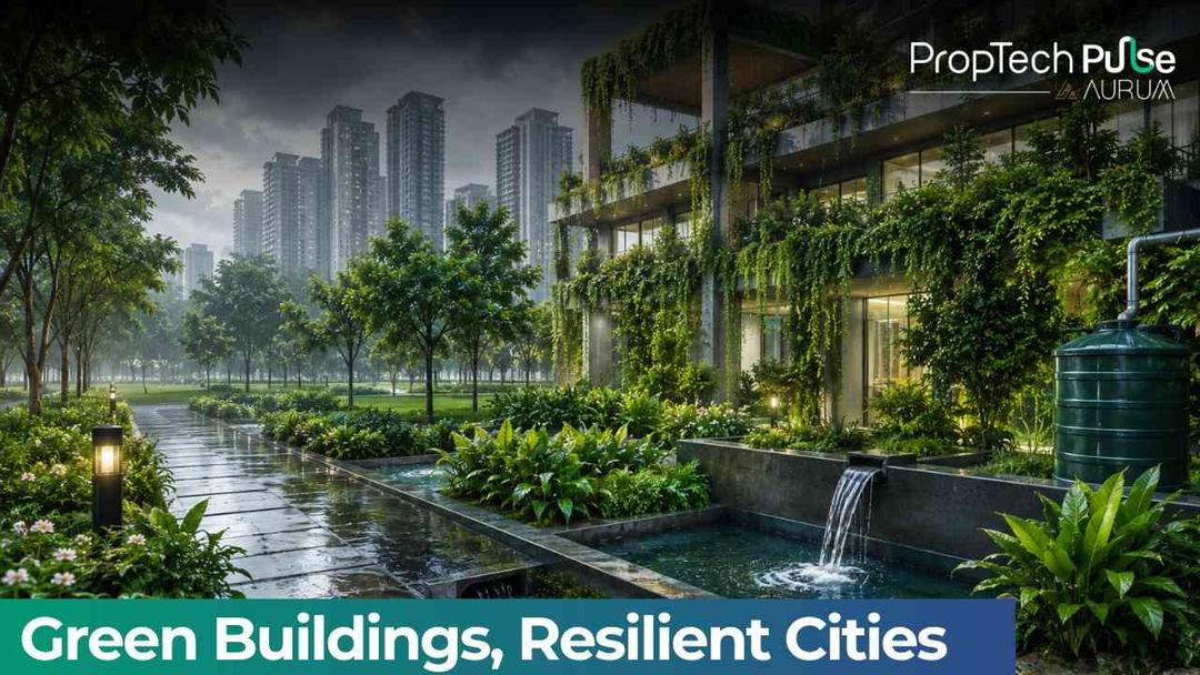
Green Buildings & Monsoon-Ready Indian Cities | 2026
Every year, the southwest monsoon transforms India's landscape, replenishing water resources and supporting millions of livelihoods. It also reminds us of an important reality: our cities must be designed to manage water more efficiently. Today, real estate is responding with smarter, greener, and more resilient developments. Green buildings are no longer just about sustainability; they are becoming an essential part of building cities that are better prepared for changing weather patterns. Building with the Monsoon in Mind Modern real estate developments are increasingly incorporating features that work with nature rather than against it. Many green buildings now include: Rainwater harvesting systems Efficient stormwater drainage Permeable pavements Native landscaping Water-efficient plumbing Green roofs and open spaces These features help capture rainwater, reduce surface runoff, and improve water management throughout the year. Sustainability That Delivers Measurable Results The adoption of green buildings is creating tangible environmental benefits. Across India, certified green buildings collectively save an estimated 199.3 billion litres of water every year, demonstrating how sustainable design can significantly improve resource efficiency. Mumbai also leads the country with over 500 IGBC-certified green buildings, reflecting the growing focus on environmentally responsible urban development. These numbers highlight a broader industry shift—from simply constructing buildings to creating long-term, sustainable assets. Why Homebuyers Are Paying Attention Today's homebuyers are looking beyond location and amenities. Increasingly, they value communities that offer: Better water conservation Lower long-term maintenance costs Sustainable infrastructure Healthier living environments Future-ready building design As environmental awareness grows, sustainability is becoming an important factor in property decisions. Where PropTech Fits In Technology is accelerating this transformation. Modern developments are leveraging PropTech solutions such as: Smart water monitoring systems IoT-enabled building management Automated irrigation Energy and water usage analytics Predictive maintenance solutions These innovations help optimise resources while improving operational efficiency for developers, property managers, and residents alike. Building Resilience for the Future Climate resilience is becoming an integral part of urban planning. Developers are increasingly recognising that sustainable buildings not only reduce environmental impact but also improve long-term asset value and enhance the overall living experience. As cities continue to grow, integrating green infrastructure into real estate will play a crucial role in creating healthier and more resilient communities. The future of real estate isn't just about building taller or faster. It's about building smarter. And as India continues to urbanise, green buildings will help ensure that cities are prepared not only for today's monsoon but also for the decades ahead. FAQs – Green Buildings & Monsoon-Ready Cities * { margin: 0; padding: 0; box-sizing: border-box; } body { // font-family: 'DM Sans', sans-serif; // background: #f7faf8; // color: #2d3b35; // padding: 40px 20px; } .faq-wrapper { max-width: 780px; margin: 0 auto; } .faq-header { text-align: center; margin-bottom: 44px; } .faq-header h2 { font-family: 'Playfair Display', serif; font-size: 32px; font-weight: 600; color: #1a2e23; margin-bottom: 10px; letter-spacing: -0.3px; } .faq-header p { font-size: 15px; color: #6b7f74; max-width: 500px; margin: 0 auto; line-height: 1.6; } .faq-card { border-radius: 14px; margin-bottom: 16px; overflow: hidden; transition: box-shadow 0.3s ease; cursor: pointer; } .faq-card:hover { box-shadow: 0 4px 20px rgba(45, 90, 65, 0.08); } /* Alternating light colour shades */ .faq-card:nth-child(1) { background: #eaf5ee; } /* soft mint */ .faq-card:nth-child(2) { background: #e8f0f8; } /* soft sky */ .faq-card:nth-child(3) { background: #f0f5ea; } /* soft sage */ .faq-card:nth-child(4) { background: #fef6ea; } /* soft peach */ .faq-card:nth-child(5) { background: #eef0f6; } /* soft lavender */ .faq-card:nth-child(6) { background: #eaf5f2; } /* soft teal */ .faq-question { display: flex; align-items: center; justify-content: space-between; padding: 22px 28px; gap: 16px; user-select: none; } .faq-question span { font-size: 16px; font-weight: 600; color: #1a2e23; line-height: 1.45; flex: 1; } .faq-icon { width: 32px; height: 32px; border-radius: 50%; background: rgba(255, 255, 255, 0.7); display: flex; align-items: center; justify-content: center; flex-shrink: 0; transition: transform 0.3s ease, background 0.3s ease; } .faq-icon svg { width: 16px; height: 16px; stroke: #3a6b50; transition: transform 0.3s ease; } .faq-card.active .faq-icon { background: rgba(255, 255, 255, 0.95); } .faq-card.active .faq-icon svg { transform: rotate(45deg); } .faq-answer { max-height: 0; overflow: hidden; transition: max-height 0.35s ease, padding 0.35s ease; } .faq-answer-inner { padding: 0 28px 24px 28px; font-size: 15px; line-height: 1.7; color: #3d5347; } .faq-card.active .faq-answer { max-height: 300px; } .faq-tag { display: inline-block; font-size: 11px; font-weight: 500; text-transform: uppercase; letter-spacing: 0.8px; padding: 4px 10px; border-radius: 6px; background: rgba(255,255,255,0.6); color: #4a7a5e; margin-bottom: 10px; } @media (max-width: 600px) { .faq-header h2 { font-size: 26px; } .faq-question { padding: 18px 20px; } .faq-question span { font-size: 15px; } .faq-answer-inner { padding: 0 20px 20px 20px; font-size: 14px; } } Frequently Asked Questions Everything you need to know about green buildings and monsoon-ready urban development in India. Why are green buildings important during the monsoon season? Water Management Green buildings are designed with features like rainwater harvesting systems, stormwater drainage, and permeable pavements that help manage heavy rainfall efficiently. Instead of letting monsoon water go to waste or cause flooding, these systems capture and redirect it — reducing surface runoff and recharging groundwater reserves. How do IGBC-certified buildings help save water? Certification IGBC (Indian Green Building Council) certified buildings follow strict sustainability standards that include water-efficient plumbing, recycling systems, and native landscaping that requires less irrigation. Collectively, certified green buildings in India save an estimated 199.3 billion litres of water every year. What is PropTech and how does it support sustainability? Technology PropTech (Property Technology) refers to digital tools and platforms that improve how real estate is designed, managed, and operated. In the context of sustainability, PropTech includes smart water monitoring systems, IoT-enabled building management, automated irrigation, and predictive maintenance solutions — all of which help optimise resource usage and reduce waste. Do green buildings cost more than conventional buildings? Investment While the upfront construction cost of a green building can be marginally higher, the long-term savings on water bills, energy consumption, and maintenance typically offset the initial investment. Many homebuyers now recognise this value, viewing green buildings as cost-effective, future-ready assets rather than a premium expense. Which Indian city leads in green building adoption? Industry Mumbai currently leads India with over 500 IGBC-certified green buildings, reflecting the city's growing commitment to environmentally responsible urban development. Other major cities like Bengaluru, Hyderabad, and Delhi-NCR are also seeing rapid growth in green-certified real estate projects. Will sustainability become a deciding factor for homebuyers? Future Outlook All signs point to yes. As environmental awareness grows and climate events become more frequent, buyers are increasingly prioritising water conservation, sustainable infrastructure, and healthier living environments. Developers who invest in green features now are likely to see stronger demand and better long-term asset value in the years ahead. function toggleFaq(el) { const card = el.closest('.faq-card'); const isActive = card.classList.contains('active'); // Close all open cards document.querySelectorAll('.faq-card.active').forEach(function(c) { c.classList.remove('active'); }); // Toggle clicked card if (!isActive) { card.classList.add('active'); } }
PropTech Pulse Editorial
10th July 2026

AI Agent
Buyer Engagement Signals in Real Estate: How Pulse AI Measures Interaction Quality
Why Engagement Quality Matters in Real Estate Real estate engagement often generates a large number of interactions, but not all interactions reflect genuine interest. Some conversations remain superficial, while others demonstrate deeper commitment and understanding. Distinguishing between these interaction types is essential for an accurate engagement strategy. Pulse AI focuses on analysing buyer engagement signals to determine the quality and depth of each interaction. Understanding Engagement Signals in Conversations Engagement signals appear through behavioural indicators such as response consistency, depth of questioning, and conversational progression. Buyers who actively participate in structured discussions often show stronger decision intent. Pulse AI captures these behavioural patterns and translates them into measurable insight. This approach strengthens buyer engagement signals as a reliable indicator of buyer involvement. Detecting Meaningful Interaction Patterns Meaningful engagement is often characterised by thoughtful questions, consistent follow-ups, and progression from general enquiries to specific concerns. Pulse AI analyses these patterns across conversations to identify which interactions reflect serious evaluation. This structured observation enhances buyer interaction patterns as a valuable engagement metric. Improving Engagement Strategy With Behavioural Insight Understanding engagement signals enables organisations to adapt communication strategies effectively. Pulse AI highlights interactions that demonstrate strong buyer participation so teams can prioritise them appropriately. This capability reinforces AI behavioural insights as a practical tool for engagement planning. Supporting Sales Teams With Interaction Context Sales advisors benefit when they understand the nature of prior buyer engagement. Pulse AI summarises interaction patterns to provide clear context before conversations begin. This preparation allows advisors to build on previous discussions rather than restarting them. Such operational clarity strengthens proptech intelligence across the engagement pipeline. Enhancing Marketing Through Engagement Trends Aggregated engagement signals reveal broader trends about how buyers interact with property information. Pulse AI analyses these patterns to inform marketing strategies and messaging approaches. This insight highlights the strategic value of conversational AI analytics in refining communication effectiveness. Reducing Pipeline Noise Through Engagement Analysis Without analysing engagement quality, pipelines can become crowded with interactions that do not represent real opportunities. Pulse AI filters this noise by identifying signals that reflect genuine buyer involvement. This clarity supports real estate interaction quality as a key metric for pipeline health. Turning Engagement Insight Into Better Conversions Recognising which interactions reflect meaningful engagement allows organisations to allocate attention more effectively. Pulse AI transforms conversational behaviour into structured engagement intelligence that guides prioritisation and communication strategy. By focusing on genuine buyer involvement, pulse AI helps real estate organisations strengthen relationships and convert engagement into confident purchasing decisions. Enjoyed this blog article? Visit PropTech Pulse for more interesting blogs.
PropTech Pulse Editorial
5th March 2026

AI Agent
Buyer Evaluation Signals in Real Estate How Pulse AI Tracks Comparison Behaviour
Why Buyer Evaluation Determines Conversion Outcomes In real estate, the evaluation stage is where interest begins to transform into serious consideration. Buyers compare locations, analyse pricing structures, and weigh trade-offs between different property options. Understanding how buyers evaluate choices can reveal how close they are to making a decision. Pulse AI focuses on detecting evaluation signals within conversations to uncover how buyers assess their options. Understanding Evaluation Signals in Buyer Behaviour Evaluation signals appear when buyers shift from general curiosity to comparative questioning. Discussions about differences between configurations, price justifications, or long-term value indicate a deeper analytical mindset. Pulse AI captures these conversational patterns and interprets them as measurable indicators. This capability strengthens buyer evaluation signals as a key stage in the decision journey. Recognising Comparison Patterns in Conversations When buyers begin comparing features, amenities, or payment structures, they are actively narrowing their options. Pulse AI identifies these comparison patterns by analysing repeated references to alternatives and decision criteria. This structured analysis enhances real estate comparison behaviour insights that help organisations understand how buyers weigh choices. Improving Engagement Through Evaluation Awareness Understanding when buyers enter the evaluation phase allows organisations to adapt engagement accordingly. Pulse AI highlights evaluation signals so teams can provide more detailed explanations and evidence-based information. This alignment strengthens AI buyer analysis as a tool for precise communication. Supporting Sales Teams With Evaluation Context Sales advisors benefit greatly when they understand which comparisons buyers are actively considering. Pulse AI summarises evaluation signals so conversations begin with relevant context rather than generic introductions. This preparation reinforces proptech intelligence as a practical operational advantage. Enhancing Marketing Strategy With Evaluation Insights Aggregated evaluation signals reveal which aspects of properties attract the most comparison and scrutiny. Pulse AI surfaces these insights to inform marketing strategies and content development. This feedback loop demonstrates the importance of conversational AI insights in refining communication approaches. Reducing Decision Delays Through Guided Evaluation Buyers often experience delays when comparisons become overwhelming or unclear. Pulse AI helps organise evaluation discussions so buyers can analyse options logically and efficiently. This structured guidance supports buyer decision indicators that encourage steady progression. Turning Evaluation Insight Into Strategic Engagement Evaluation signals provide a window into how buyers think during the decision process. Pulse AI converts these behavioural patterns into structured intelligence that informs engagement timing, messaging, and sales preparation. By understanding how buyers compare and analyse options, pulse AI helps real estate organisations guide conversations toward confident and well-informed decisions. Enjoyed this blog article? Visit PropTech Pulse for more interesting blogs.
PropTech Pulse Editorial
4th March 2026
Uncategorized
Green Buildings & Monsoon-Ready Indian Cities | 2026
Every year, the southwest monsoon transforms India's landscape, replenishing water resources and supporting millions of livelihoods. It also reminds us of an important reality: our cities must be designed to manage water more efficiently. Today, real estate is responding with smarter, greener, and more resilient developments. Green buildings are no longer just about sustainability; they are becoming an essential part of building cities that are better prepared for changing weather patterns. Building with the Monsoon in Mind Modern real estate developments are increasingly incorporating features that work with nature rather than against it. Many green buildings now include: Rainwater harvesting systems Efficient stormwater drainage Permeable pavements Native landscaping Water-efficient plumbing Green roofs and open spaces These features help capture rainwater, reduce surface runoff, and improve water management throughout the year. Sustainability That Delivers Measurable Results The adoption of green buildings is creating tangible environmental benefits. Across India, certified green buildings collectively save an estimated 199.3 billion litres of water every year, demonstrating how sustainable design can significantly improve resource efficiency. Mumbai also leads the country with over 500 IGBC-certified green buildings, reflecting the growing focus on environmentally responsible urban development. These numbers highlight a broader industry shift—from simply constructing buildings to creating long-term, sustainable assets. Why Homebuyers Are Paying Attention Today's homebuyers are looking beyond location and amenities. Increasingly, they value communities that offer: Better water conservation Lower long-term maintenance costs Sustainable infrastructure Healthier living environments Future-ready building design As environmental awareness grows, sustainability is becoming an important factor in property decisions. Where PropTech Fits In Technology is accelerating this transformation. Modern developments are leveraging PropTech solutions such as: Smart water monitoring systems IoT-enabled building management Automated irrigation Energy and water usage analytics Predictive maintenance solutions These innovations help optimise resources while improving operational efficiency for developers, property managers, and residents alike. Building Resilience for the Future Climate resilience is becoming an integral part of urban planning. Developers are increasingly recognising that sustainable buildings not only reduce environmental impact but also improve long-term asset value and enhance the overall living experience. As cities continue to grow, integrating green infrastructure into real estate will play a crucial role in creating healthier and more resilient communities. The future of real estate isn't just about building taller or faster. It's about building smarter. And as India continues to urbanise, green buildings will help ensure that cities are prepared not only for today's monsoon but also for the decades ahead. FAQs – Green Buildings & Monsoon-Ready Cities * { margin: 0; padding: 0; box-sizing: border-box; } body { // font-family: 'DM Sans', sans-serif; // background: #f7faf8; // color: #2d3b35; // padding: 40px 20px; } .faq-wrapper { max-width: 780px; margin: 0 auto; } .faq-header { text-align: center; margin-bottom: 44px; } .faq-header h2 { font-family: 'Playfair Display', serif; font-size: 32px; font-weight: 600; color: #1a2e23; margin-bottom: 10px; letter-spacing: -0.3px; } .faq-header p { font-size: 15px; color: #6b7f74; max-width: 500px; margin: 0 auto; line-height: 1.6; } .faq-card { border-radius: 14px; margin-bottom: 16px; overflow: hidden; transition: box-shadow 0.3s ease; cursor: pointer; } .faq-card:hover { box-shadow: 0 4px 20px rgba(45, 90, 65, 0.08); } /* Alternating light colour shades */ .faq-card:nth-child(1) { background: #eaf5ee; } /* soft mint */ .faq-card:nth-child(2) { background: #e8f0f8; } /* soft sky */ .faq-card:nth-child(3) { background: #f0f5ea; } /* soft sage */ .faq-card:nth-child(4) { background: #fef6ea; } /* soft peach */ .faq-card:nth-child(5) { background: #eef0f6; } /* soft lavender */ .faq-card:nth-child(6) { background: #eaf5f2; } /* soft teal */ .faq-question { display: flex; align-items: center; justify-content: space-between; padding: 22px 28px; gap: 16px; user-select: none; } .faq-question span { font-size: 16px; font-weight: 600; color: #1a2e23; line-height: 1.45; flex: 1; } .faq-icon { width: 32px; height: 32px; border-radius: 50%; background: rgba(255, 255, 255, 0.7); display: flex; align-items: center; justify-content: center; flex-shrink: 0; transition: transform 0.3s ease, background 0.3s ease; } .faq-icon svg { width: 16px; height: 16px; stroke: #3a6b50; transition: transform 0.3s ease; } .faq-card.active .faq-icon { background: rgba(255, 255, 255, 0.95); } .faq-card.active .faq-icon svg { transform: rotate(45deg); } .faq-answer { max-height: 0; overflow: hidden; transition: max-height 0.35s ease, padding 0.35s ease; } .faq-answer-inner { padding: 0 28px 24px 28px; font-size: 15px; line-height: 1.7; color: #3d5347; } .faq-card.active .faq-answer { max-height: 300px; } .faq-tag { display: inline-block; font-size: 11px; font-weight: 500; text-transform: uppercase; letter-spacing: 0.8px; padding: 4px 10px; border-radius: 6px; background: rgba(255,255,255,0.6); color: #4a7a5e; margin-bottom: 10px; } @media (max-width: 600px) { .faq-header h2 { font-size: 26px; } .faq-question { padding: 18px 20px; } .faq-question span { font-size: 15px; } .faq-answer-inner { padding: 0 20px 20px 20px; font-size: 14px; } } Frequently Asked Questions Everything you need to know about green buildings and monsoon-ready urban development in India. Why are green buildings important during the monsoon season? Water Management Green buildings are designed with features like rainwater harvesting systems, stormwater drainage, and permeable pavements that help manage heavy rainfall efficiently. Instead of letting monsoon water go to waste or cause flooding, these systems capture and redirect it — reducing surface runoff and recharging groundwater reserves. How do IGBC-certified buildings help save water? Certification IGBC (Indian Green Building Council) certified buildings follow strict sustainability standards that include water-efficient plumbing, recycling systems, and native landscaping that requires less irrigation. Collectively, certified green buildings in India save an estimated 199.3 billion litres of water every year. What is PropTech and how does it support sustainability? Technology PropTech (Property Technology) refers to digital tools and platforms that improve how real estate is designed, managed, and operated. In the context of sustainability, PropTech includes smart water monitoring systems, IoT-enabled building management, automated irrigation, and predictive maintenance solutions — all of which help optimise resource usage and reduce waste. Do green buildings cost more than conventional buildings? Investment While the upfront construction cost of a green building can be marginally higher, the long-term savings on water bills, energy consumption, and maintenance typically offset the initial investment. Many homebuyers now recognise this value, viewing green buildings as cost-effective, future-ready assets rather than a premium expense. Which Indian city leads in green building adoption? Industry Mumbai currently leads India with over 500 IGBC-certified green buildings, reflecting the city's growing commitment to environmentally responsible urban development. Other major cities like Bengaluru, Hyderabad, and Delhi-NCR are also seeing rapid growth in green-certified real estate projects. Will sustainability become a deciding factor for homebuyers? Future Outlook All signs point to yes. As environmental awareness grows and climate events become more frequent, buyers are increasingly prioritising water conservation, sustainable infrastructure, and healthier living environments. Developers who invest in green features now are likely to see stronger demand and better long-term asset value in the years ahead. function toggleFaq(el) { const card = el.closest('.faq-card'); const isActive = card.classList.contains('active'); // Close all open cards document.querySelectorAll('.faq-card.active').forEach(function(c) { c.classList.remove('active'); }); // Toggle clicked card if (!isActive) { card.classList.add('active'); } }
PropTech Pulse Editorial
10th July 2026
AI Agent
Buyer Engagement Signals in Real Estate: How Pulse AI Measures Interaction Quality
Why Engagement Quality Matters in Real Estate Real estate engagement often generates a large number of interactions, but not all interactions reflect genuine interest. Some conversations remain superficial, while others demonstrate deeper commitment and understanding. Distinguishing between these interaction types is essential for an accurate engagement strategy. Pulse AI focuses on analysing buyer engagement signals to determine the quality and depth of each interaction. Understanding Engagement Signals in Conversations Engagement signals appear through behavioural indicators such as response consistency, depth of questioning, and conversational progression. Buyers who actively participate in structured discussions often show stronger decision intent. Pulse AI captures these behavioural patterns and translates them into measurable insight. This approach strengthens buyer engagement signals as a reliable indicator of buyer involvement. Detecting Meaningful Interaction Patterns Meaningful engagement is often characterised by thoughtful questions, consistent follow-ups, and progression from general enquiries to specific concerns. Pulse AI analyses these patterns across conversations to identify which interactions reflect serious evaluation. This structured observation enhances buyer interaction patterns as a valuable engagement metric. Improving Engagement Strategy With Behavioural Insight Understanding engagement signals enables organisations to adapt communication strategies effectively. Pulse AI highlights interactions that demonstrate strong buyer participation so teams can prioritise them appropriately. This capability reinforces AI behavioural insights as a practical tool for engagement planning. Supporting Sales Teams With Interaction Context Sales advisors benefit when they understand the nature of prior buyer engagement. Pulse AI summarises interaction patterns to provide clear context before conversations begin. This preparation allows advisors to build on previous discussions rather than restarting them. Such operational clarity strengthens proptech intelligence across the engagement pipeline. Enhancing Marketing Through Engagement Trends Aggregated engagement signals reveal broader trends about how buyers interact with property information. Pulse AI analyses these patterns to inform marketing strategies and messaging approaches. This insight highlights the strategic value of conversational AI analytics in refining communication effectiveness. Reducing Pipeline Noise Through Engagement Analysis Without analysing engagement quality, pipelines can become crowded with interactions that do not represent real opportunities. Pulse AI filters this noise by identifying signals that reflect genuine buyer involvement. This clarity supports real estate interaction quality as a key metric for pipeline health. Turning Engagement Insight Into Better Conversions Recognising which interactions reflect meaningful engagement allows organisations to allocate attention more effectively. Pulse AI transforms conversational behaviour into structured engagement intelligence that guides prioritisation and communication strategy. By focusing on genuine buyer involvement, pulse AI helps real estate organisations strengthen relationships and convert engagement into confident purchasing decisions. Enjoyed this blog article? Visit PropTech Pulse for more interesting blogs.
PropTech Pulse Editorial
5th March 2026

Ask Pulse Ai anything about real estate

Unlock the Latest in Real Estate
News, Infographics, Blogs & More! Delivered to your inbox.