New Launch - India Real Estate Report 2026.

Services
Knowledge Hub
Resources
Tools

Ask Pulse Ai
©PropTech Pulse 2025, All rights reserved.


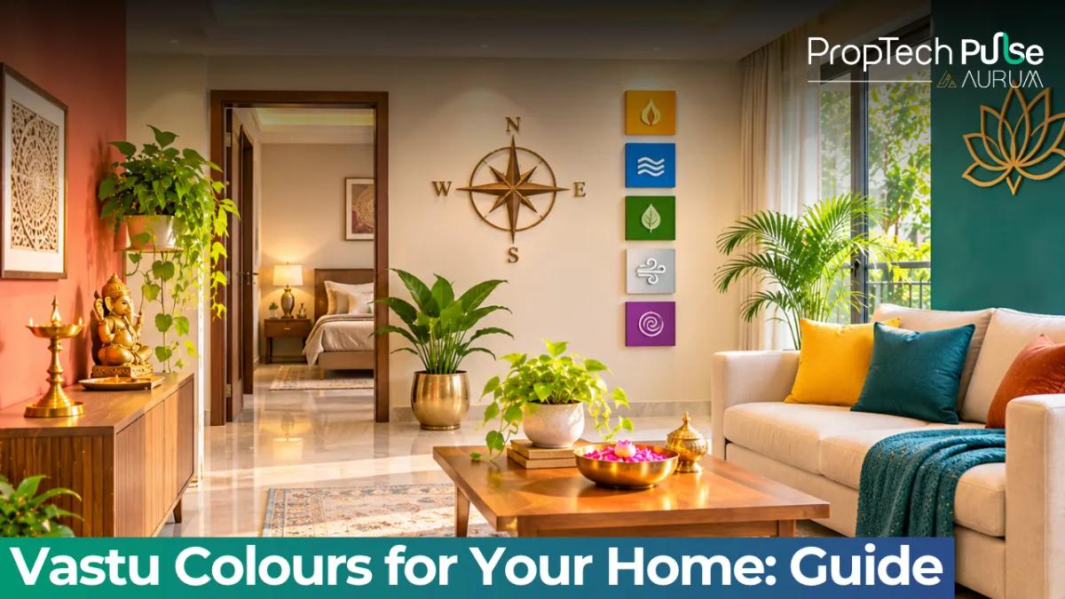
Choosing the right paints for your walls does more than refresh a flat or house; it sets the tone for daily living. When you apply vastu colours for home planning, you are using shade and hue to align a space with natural energy flows.
This guide breaks down those traditions into simple, reversible steps that work for modern Indian apartments.
The logic behind house paint colour Vastu
Quick answer
Vastu maps colours to five elements and eight directions. Painting acts as a lightweight corrective tool, balancing directional energies without moving load-bearing walls or expensive furniture.
Traditional Vastu Shastra divides a floor plan into eight zones, each governed by one of the five elements: earth, water, fire, air, and space.
Every element carries a specific vibrational frequency. Colours behave like acoustic diffusers, either amplifying or dampening that frequency depending on their wavelength and saturation.
Instead of rearranging heavy wardrobes or building partitions, house paint colour adjustments let you shift the elemental weight of a room cheaply.
A south-west wall feels grounded when painted in earthy browns. Light pastels pull a cramped north-east corridor back into openness. You treat the paint as the final layer that settles the architectural layout.
If you want to see how ancient principles shape modern floor plans, read more about understanding how Vastu Shastra influences real estate design.
Colours by direction Vastu: the eight-point guide
Each quadrant carries distinct elemental requirements. South and south-west demand grounding heaviness. North and east thrive on bright, reflective tones. Fire zones accept warmth but struggle with cold washes.
| Direction | Governing Element | Recommended Hue Families |
|---|---|---|
| North | Water | Shades of blue, grey, metallic silver |
| North-East | Space / Water | White, pale yellow, very light pastels |
| East | Air | Light green, fresh sky blue, soft creams |
| South-East | Fire | Warm cream, soft orange, yellow accents |
| South | Earth | Warm yellows, ochre, muted terracotta |
| South-West | Earth | Darker earth tones, sand, taupe, light brown |
| West | Metal | White, cream, silver, rose pink accents |
| North-West | Air / Fire | Orange, grey, cool reds, pale beige |
True north matters. Builder plans often assume magnetic north, but a compass reading usually shows a slight declination depending on your city. Always verify your actual front door facing before buying paint, especially for older apartments.
Finding the right living room colour Vastu scheme
The reception area typically faces north or east, where morning sunlight enters first. Cream, off-white, and pale beige reflect daylight without washing out the space.
These shades encourage movement and conversation, keeping the household energy active.
If your main living area faces west, expect harsh afternoon heat and glare. Introduce muted terracotta, warm peach, or pale gold to absorb the visual intensity.
A heavy glass chandelier or polished stone tabletop adds necessary metallic weight to the west zone.
For detailed inspiration on matching paint choices with your layout, see our guide on practical ideas for hall layout, colours and budget. Avoid high-gloss finishes here. Matte or eggshell paints diffuse light evenly, whereas satin or emulsion finishes create sharp reflections that disturb the calm Vastu intends for gathering spaces.
Master bedroom colour as per Vastu for restful sleep
The master bedroom belongs in the south-west corner, governed strictly by the earth element.
Traditional texts advise heavy, grounding shades like sand, taupe, light chocolate, or muted brick-red. These colours support stability, marital harmony, and deep rest.
Do not use jet black or stark white in large doses for bedroom walls. Black absorbs all positive warmth and leaves the occupant feeling emotionally detached, while pure white saps the earthy support required for recovery after a long workday.
Keep the ceiling near-pure white to maintain height and prevent the room from feeling claustrophobic.
If you want to explore how neutral palettes extend beyond sleeping quarters, check designing your pooja room according to traditional guidelines for complementary colour combinations.
Kitchens, puja rooms, and bathrooms
Kitchens sit in the south-east fire zone. Warm cream, light yellow, or soft peach work well. Never paint kitchen walls dark blue, since water clashes directly with the cooking fire and disrupts domestic harmony.
Puja rooms require northern-eastern purity. Stick to white, very pale yellow, or ivory.
These tones keep the mind clear during meditation and discourage mental clutter. Bright oranges and deep reds overwhelm the delicate spiritual focus expected in this quadrant.
Bathrooms trap moisture and generate stagnant energy. Choose mould-resistant paints in clean whites or very pale greens.
Pale green introduces a subtle wood-water balance that neutralises the dampness, preventing the bathroom from feeling like a draining hole in the house layout.
How natural light and paint finishes interact
Directional orientation changes how paint performs once dry. North-facing rooms sit in steady, indirect light.
Warm undertones keep the space from feeling sterile while respecting the water element. East walls take heavy morning sun; low-reflectance matte paints cut the glare entirely for anyone working at a desk.
West-facing rooms take a constant battering from afternoon sun. High sheen paints bounce heat inside and fade rapidly.
Satin finishes offer a safer middle ground, handling traffic without trapping warmth. Always test swatches across several hours. A quiet noon shade turns aggressive by evening.
When selecting vastu colours for home interiors, remember that finish texture alters how directional energy moves through a room. Rough textured paints absorb ambient vibration, whereas smooth finishes bounce it back toward the centre of the hall.
Understanding how raw materials meet daily wear helps homeowners avoid costly repainting.
Read our notes on the complete journey of building a new home in India to learn how material selection impacts long-term maintenance.
Modern apartment constraints: renters, declination, and lighting
Many tenants cannot repaint entire flats due to landlord restrictions. In rental units, use textiles to carry the directional load.
A navy curtain, silver throw blanket, or green floor mat handles the north-water requirement without breaking lease terms. Switching out curtains seasonally costs far less than repainting.
Builder layouts frequently ignore magnetic declination.
Measuring the actual plot facing prevents you from painting a south-east wall blue simply because the blueprint labeled it north. Verify orientation with a physical compass before purchasing gallons of paint.
Consider ceiling heights alongside wall colours. Low slab apartments benefit from near-white ceilings paired with vertical stripes in lighter wall shades. This trick pulls the eye upward, preventing the room from collapsing inward. First-time buyers reviewing new projects should also review starting your journey as a first-time homebuyer in India to understand layout priorities early on.
Final thoughts: colour supports placement
Colours soften rigid layouts, but they do not replace structural fixes. If a room faces directly into a sharp concrete corner, receives constant traffic noise, or suffers from poor cross-ventilation, a new paint job will only mask the underlying problem.
Address ventilation, flooring, and furniture placement first. Treat colour as the finishing layer that reinforces sound architecture.
Frequently asked questions
What are the best colours for a north-facing house as per Vastu?
The north direction governs the water element, which thrives on cool, flowing tones. Shades of pale blue, sky blue, silver, and light grey work exceptionally well in northern walls and entrances. These hues attract wealth opportunities and maintain a steady, calm atmosphere throughout the day. Avoid heavy reds or burnt oranges near the north entrance, as they suppress the gentle water energy meant to flow inward.
Which colour should we avoid in the master bedroom according to Vastu?
Strictly avoid jet black and overwhelming quantities of pure white in the master bedroom. Black absorbs all positive warmth and leaves occupants feeling emotionally detached, while pure white drains the necessary earthy support required for deep recovery after workdays. Instead, lean towards grounding sandy browns, soft taupe, or muted brick-red. These earth tones stabilise relationships and encourage uninterrupted sleep cycles.
Can we use dark colours in a south-west facing bedroom?
Absolutely. The south-west quadrant represents the earth element, meaning heavier, darker walls actually strengthen the zone rather than harm it. Muted chocolate browns, deep greys, and rich earthy terracottas provide excellent grounding energy for the head of the household. Just ensure the ceiling remains significantly lighter than the walls to preserve a sense of spaciousness and prevent the room from feeling oppressive or cramped.
What is the ideal colour for a north-east pooja room?
The north-east corner serves as the spiritual anchor of any traditional Indian home, requiring absolute purity and clarity. White, ivory, and extremely pale yellow serve as the perfect base, allowing natural sunlight to bounce around the space unhindered. Steer clear of bold maroons, vivid oranges, or strong metallic finishes inside the prayer area, as these aggressive tones scatter mental focus and disrupt meditation practices.
How does paint finish affect Vastu energy in a home?
Texture modifies how light and vibration interact with directional energy. High-gloss or emulsion finishes create sharp, bouncing reflections that agitate peaceful zones like bedrooms and puja rooms. Opt for matte or eggshell paints in quiet areas to diffuse light gently. Reserve satin finishes only for high-touch corridors and kitchens where durability matters more than soft ambient reflection, keeping the overall elemental balance intact.
Colours balance directional energies, but they work best alongside correct placement. For readers unsure about their property's true directional alignment or who need personalised layout advice, Pulse Vastu offers a Live Vastu Check to map your specific floor plan accurately.
Sources
- Reserve Bank of India: Standardised Indian housing terminology and construction metrics used for dimensional accuracy checks (accessed October 2024)
Enjoyed this blog article? Visit PropTech Pulse for more interesting blogs.


Ask Pulse Ai anything about real estate

Unlock the Latest in Real Estate
News, Infographics, Blogs & More! Delivered to your inbox.